


The aim of this design manual is to establish a consistent and professional approach for creating and maintaining graphic and visual content for MitID's communication. MitID is a highly intricate technology that appears simple to use, even for infrequent users. MitID is an essential element (and app) of one of the world's most advanced digital societies, and we take pride in its identity. It is crucial to have a reliable and secure constant in our digital lives, which is precisely what MitID provides. As a result, MitID's design must instill confidence and serve as a visual symbol of unparalleled security in our digital world.
Art Director og Lead: Phillippe Falkesgaard
Projektleder: Louise Simoni

MitID
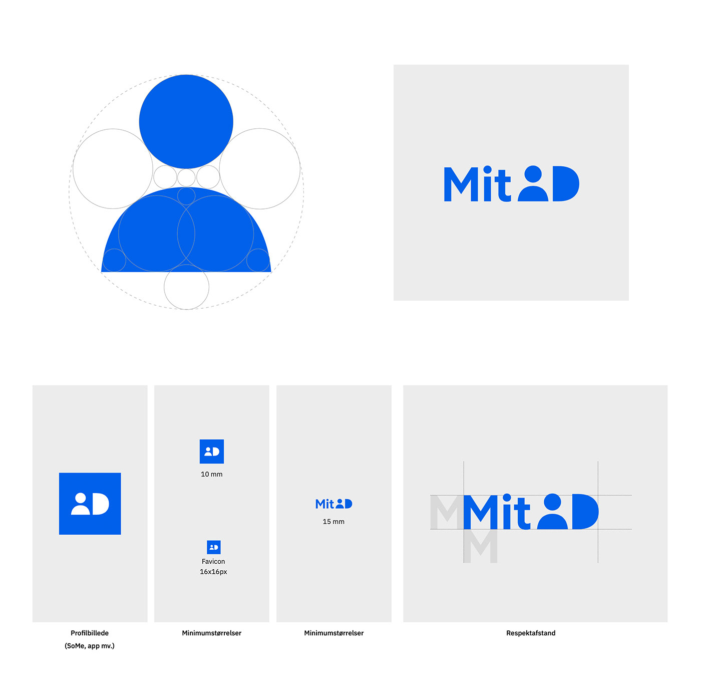
In all its simplicity, the logo symbolizes a personal and secure ID solution. The logo is meant to stand alone.
The strict and pure symmetry of the "game piece" signals in all its simplicity quality, credibility and seriousness. Its soft design provides a dynamic visual starting point and creates a platform for new possibilities and dimensions.

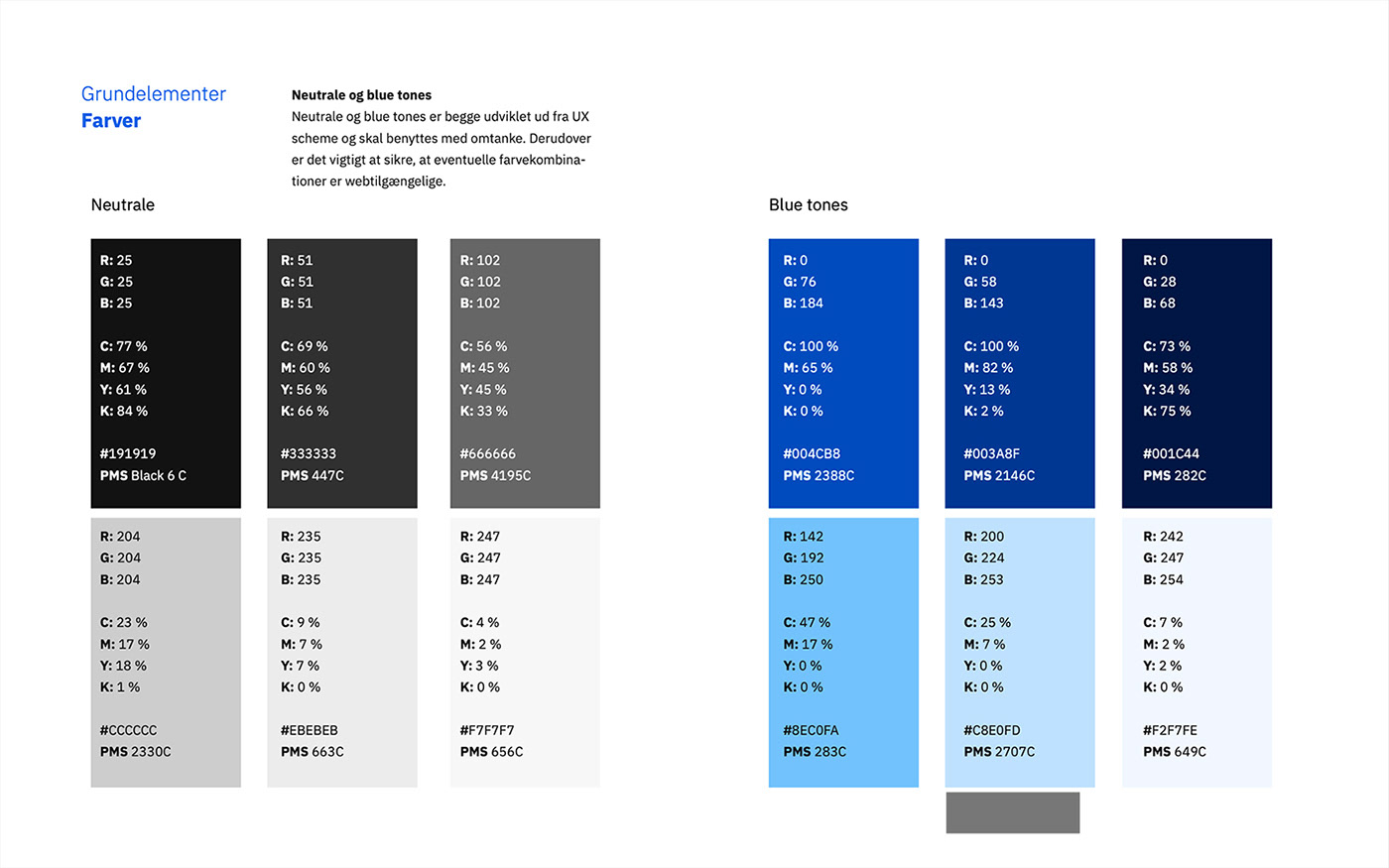
Farver

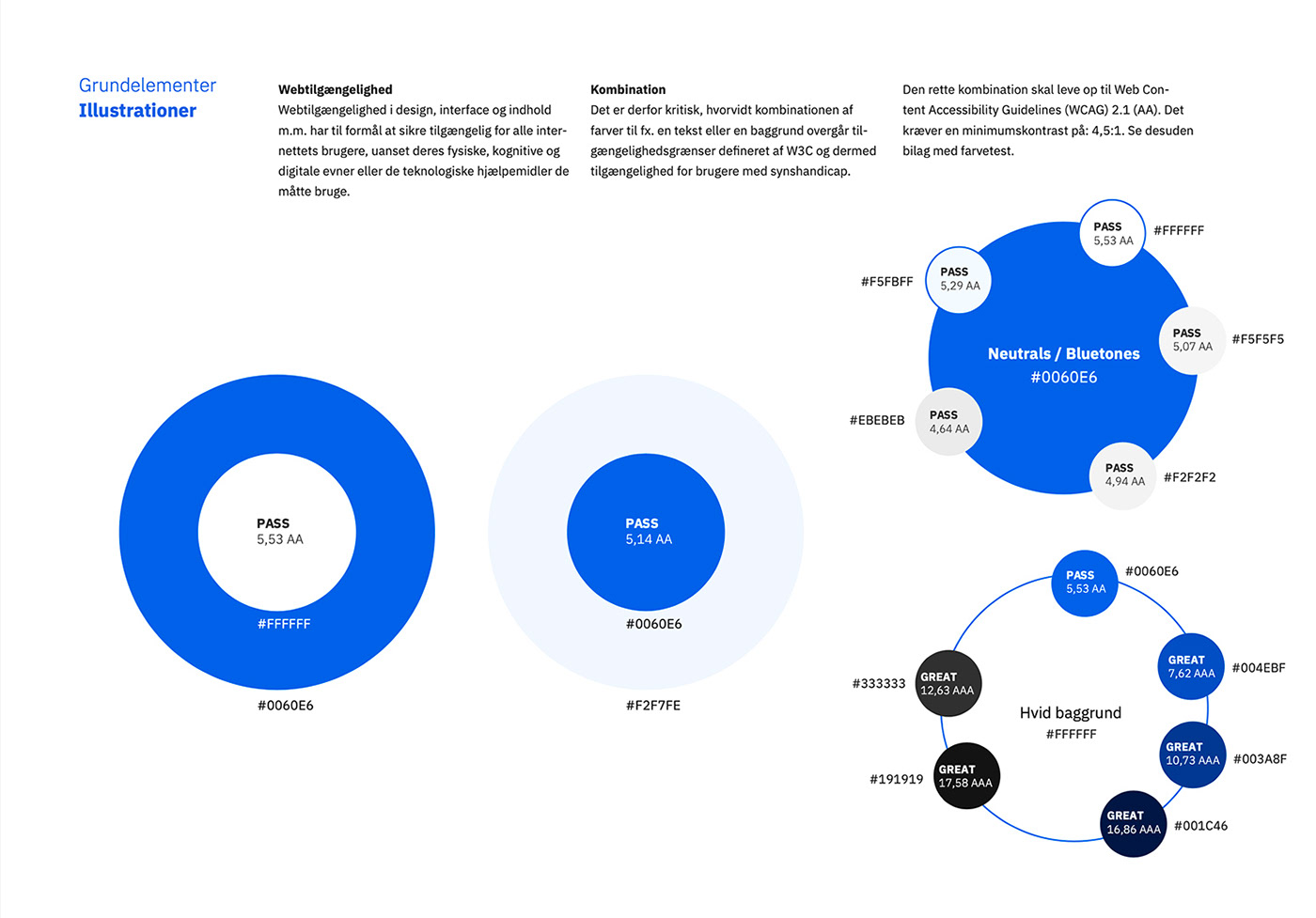
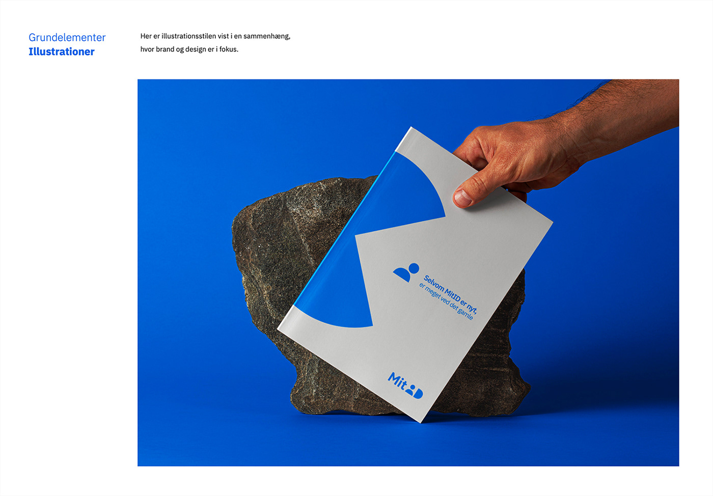
Illustrationer

Former
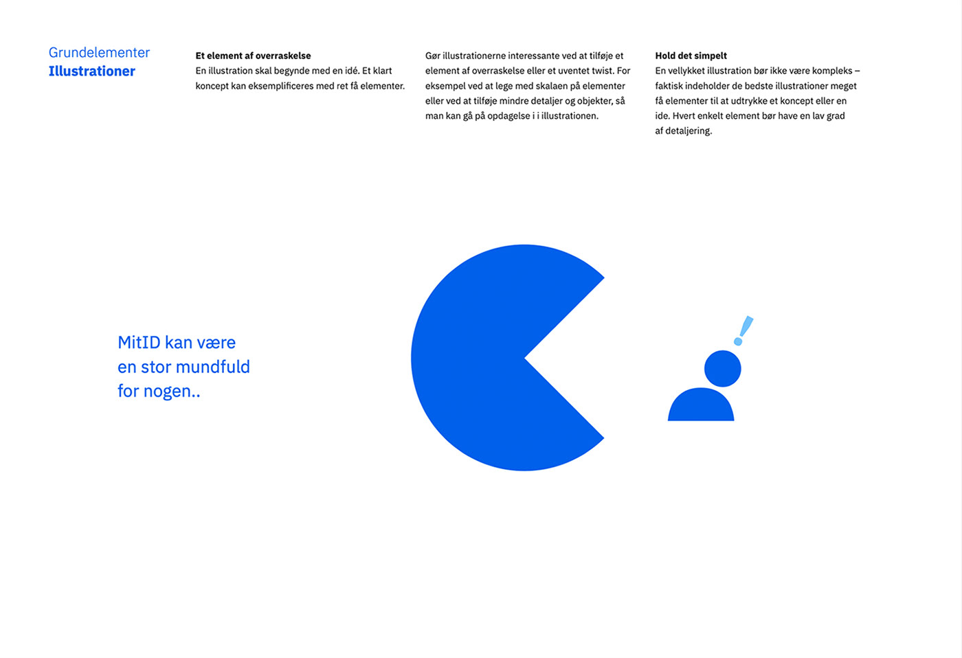
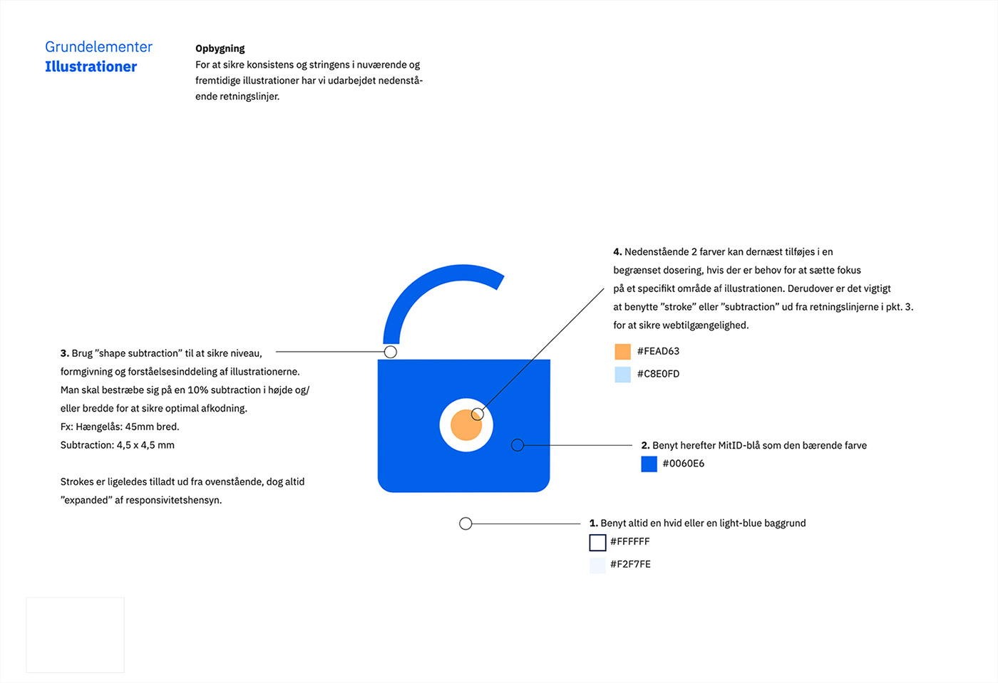
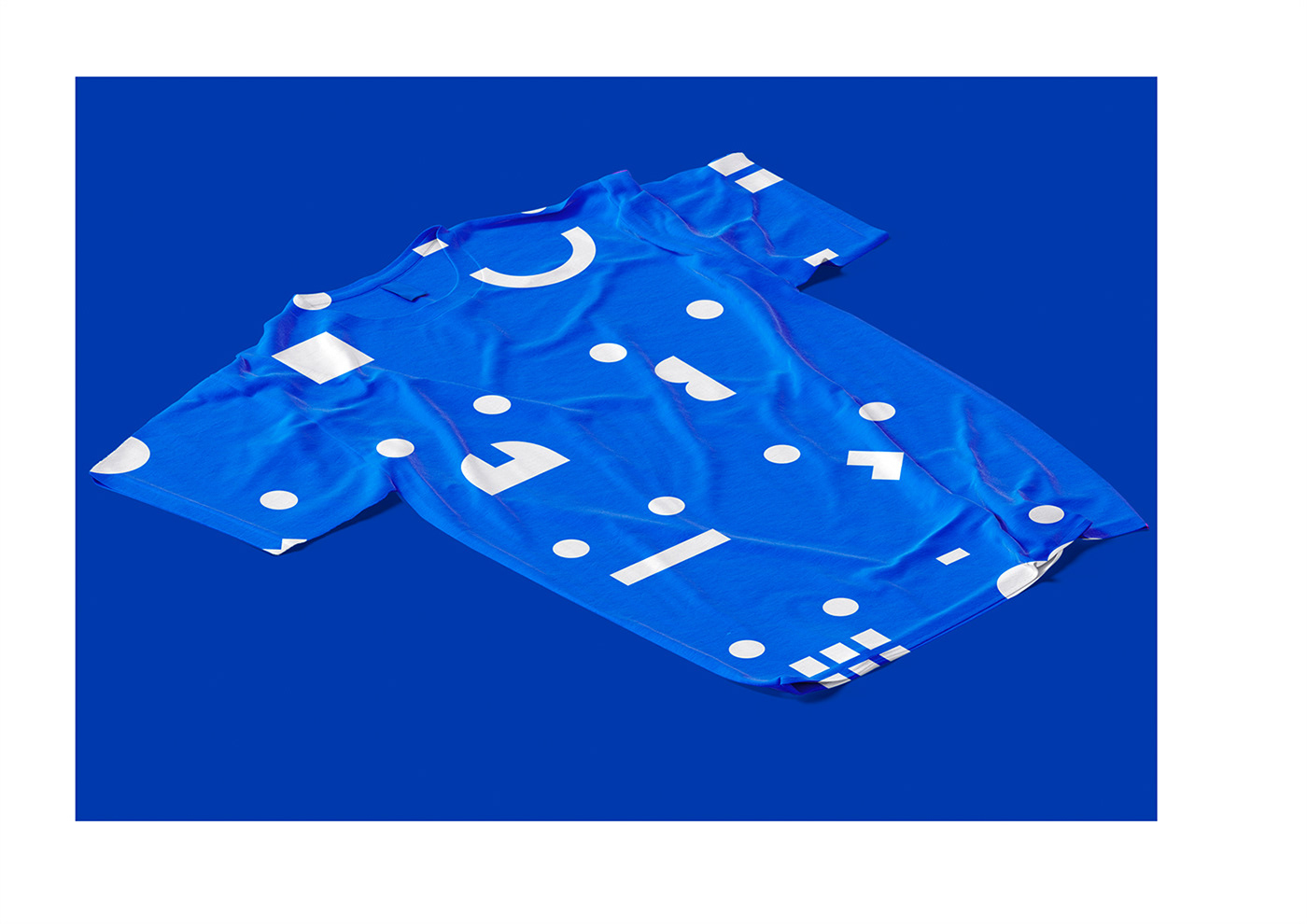
Illustrationsstilen tager udgangspunkt i elemenerne fra logo, tilsat lidt ekstra, og ud fra denne simple grundsten kan der bygges endeløse former og objekter.
Formål
Illustrationerne for MitID har to formål. Dels skal de bruges til at vække opmærksomhed og vise en tydelig brand-identitet. Derudover skal de sikre høj brugervenlighed og intuitiv forståelse for produktet. Første formål er særligt designfokuseret, mens andet formål er mere UI-fokuseret. Derfor er der en udvikling i illustrationernes kompleksitet, afhængigt af formål. Så vidt muligt opfordres der til en minimalistisk tilgang til al illustrationsudvikling for at sikre et ensrettet udtryk på tværs af platforme, devices og medier.


Motives
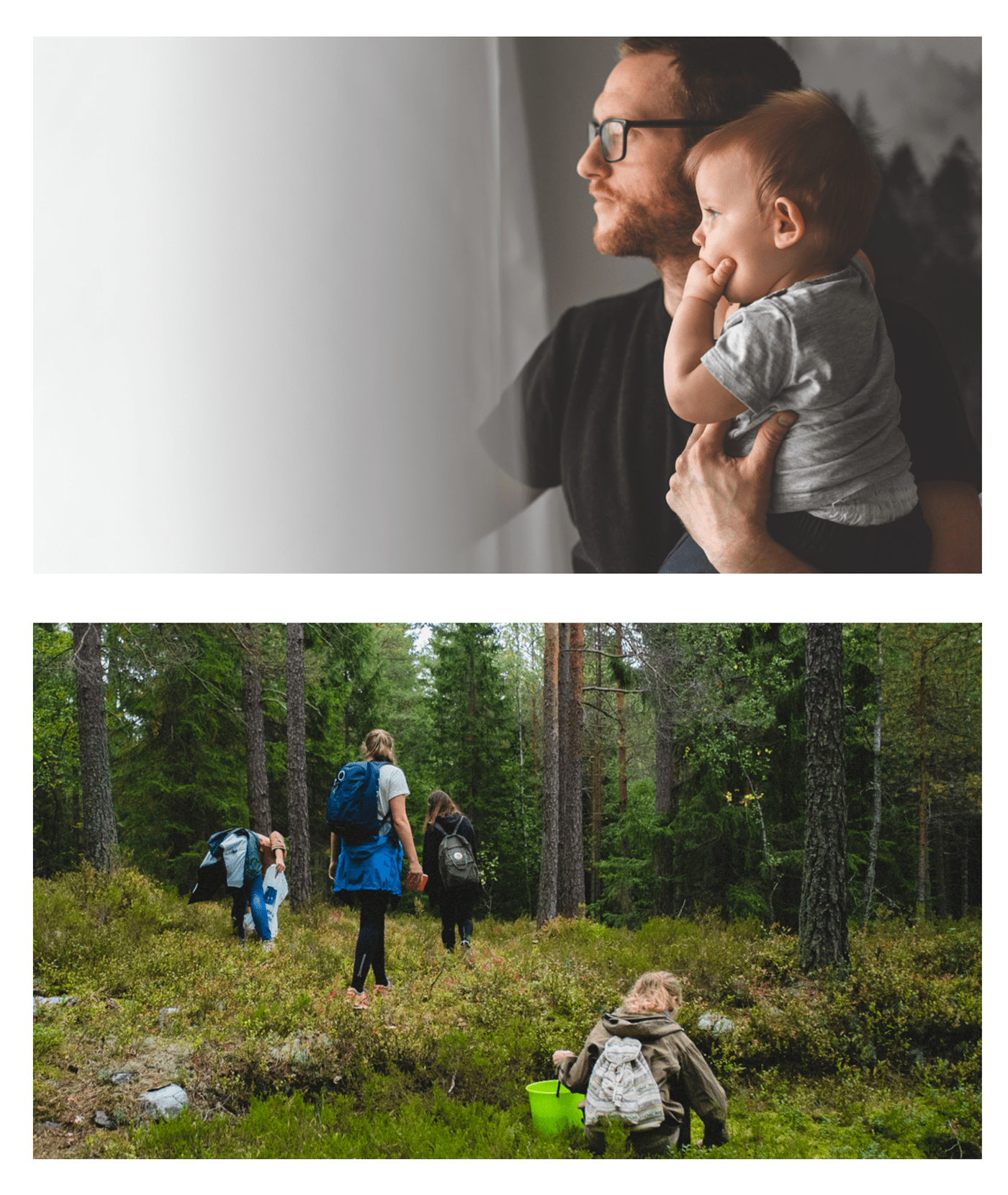
It is important that the image style and motifs reflect everyday situations and the many different phases of life. Everything from walking the dog, to life as a senior or as a new Dane, buying a home, saying goodbye or the long-awaited holiday. In other words, realistic motifs that describe natural life, for better or for worse.
Realism
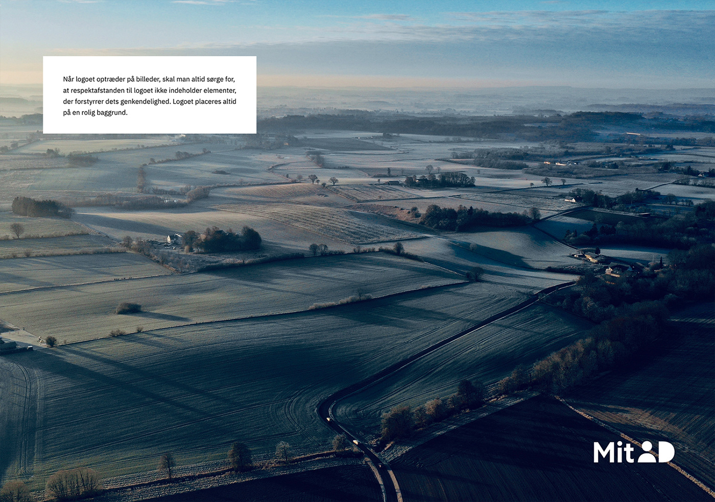
In summary, MitID should always reflect everyday situations in Denmark in the images. The scenarios must be eye-level and documentary-style.
We show both people alone and in the company of others – but always visibly present in the given situation. The persons must rest within themselves, be natural, likeable and welcoming.
Activity
Use images of people in the process of an activity whenever possible, and which seem realistic in terms of portraying all people in Denmark.
Focus
For example immersion in conversations and closeness between people, or in the time we spend alone on reflection.
Diversity
The images must show the widest possible section of the target groups and always a diverse section of the population, both in terms of gender, gender identity, age, ethnicity, sexuality and population group. The context, ie. the environment and surroundings, is – as a starting point – always contemporary Danish society and Denmark. This includes young and old, Danes and new Danes, self-driving and challenged users.
A solid balancing of motifs and text must ensure the right empathetic balance, so that the images support the text, and vice versa, but at the same time do not allow the messages to overwhelm, so that they are perceived as condescending.

Supergrafik


Thanks for watching ❤️


